Showing posts with label Practitioners. Show all posts

Friday, 8 May 2009

Otto Dettmer

Otto Dettmer

Otto studied at Kingston University. He has always had an edge for screenprinting within his work and in 1995 at Kingston, it came about for him.

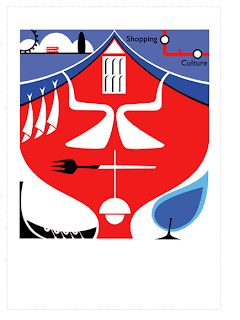
Dettmer, is very fond of producing a lot of self promotion- Mail-outs for clients for example. His work is very stripped back, and he consistently uses a limited colour palette. His work communicates effectively and is very simple.

His influences range from Saul bass, to Rodchenko ad el Lissitsky, the renaissance and figures have had a compulsivee impact upon his work presently whch he was kind enough to show us whilst he gave a talk at Stockport College. A very fururistic look, a little more empahsis on design and not as simple as some of his work but still very effective.


He began self promotion as soon as he left college, he knew of its importance, that being the reason he is still overemphasising on it today, the same as any other illustrator. But the market more recently has become very competative so there is more reason to be. He would visit London as often as he could a week and produced a range of editorials for european magazines. Otto has a very large range of stock illustration on his website – some of his past works or spot elements from illustration, expired licence which have been resold for half price. He come across very business like. When giving his talk, Otto stated the importance of being on the internet and making yourself visible to clients. He also began to talk of the future illustration being quite moving image or animation- his futuristic work depicts a feel of this. The pieces have been created using photographic reference of figures, insects and shapes, depicting a chaging monster in the city.


Andy Pavitt - Tracy Kendall - COMPARE AND CONTrAST

Andy Pavitt &Tracy Kendall

Within this report I am going to compare and contrast processes of Andy Pavitt and Tracy Kendall, to what extent they are defined by the external rigours of the market place and the industry they operate in, using information From lectures at Stockport college and discussions I have had between myself and these practitioners. I aim to talk over how these illustrators relate to me, and how I can utilise information I have gathered, applying to my own practice.

Andy Pavitt, works at the Big Orange studio in London, which has been running for 15 years. He initally came to Stockport to give us a talk about his work. I first came across Pavitt's work a little into my first year on the degree, he has always inspired me with his strict use of shape, even more so, now. Pavitts vector based illustrations, are crisp and clean, flat coloured shapes without so much use of texture. Oppositly different in practice to the work of Tracy Kendall who creates her her intensified wallpapers using blown up photographic imagery. Yet, I it is more the process that ultimately separates the two illustrators.

The Industry - Time

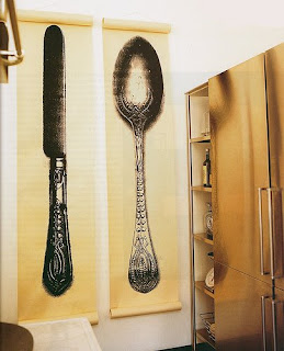
Within the art industry, 'time' is an element that always comes to haunt any designer. The difference is, with these two practitioners, due to the way they work, and who they work for, depends on the timescale they are assigned. Pavitt has been commissioned by a range of newspapers, more specifically, the guardian, (to note but one). Because a newspaper needs new illustrations everyday, that becomes the largest amount of time you will have to complete an illustration, effectively, they have to be simple, original and communicate to their full potential. Kendall has a little more slack when it comes to time. She relies a lot on editorial articles to promote herself, and to some extent is waiting on commissioners coming to her from their discovery of these articles. Her experiment in process and practice lets her work speak out for itself. In contrast to pavitts, I think the scale of Kendalls work, the innovative ‘look’ of it and how it creates a new world, differs from Pavitts editorial pieces. The general scale of one of Kendalls sheets of wallpaper is created to fit a 2.5m tall space. I love the way kendall has designed her wallpapers, in the sense that it is almost interior design due to the space they offer but yet dominate with the large image a strong design concept which interacts with everything else in the room. Like illustration, as a field of design, it can go of on many tangents of graphics and animation. These two designers both know their limitations and stick to what they are good at, but oppositly Kendall's work seems to open more doors with fields of illustration, textile and interior design. You can see this with her creation of furniture elements for example.


The Industry - Time

Within the art industry, 'time' is an element that always comes to haunt any designer. The difference is, with these two practitioners, due to the way they work, and who they work for, depends on the timescale they are assigned. Pavitt has been commissioned by a range of newspapers, more specifically, the guardian, (to note but one). Because a newspaper needs new illustrations everyday, that becomes the largest amount of time you will have to complete an illustration, effectively, they have to be simple, original and communicate to their full potential. Kendall has a little more slack when it comes to time. She relies a lot on editorial articles to promote herself, and to some extent is waiting on commissioners coming to her from their discovery of these articles. Her experiment in process and practice lets her work speak out for itself. In contrast to pavitts, I think the scale of Kendalls work, the innovative ‘look’ of it and how it creates a new world, differs from Pavitts editorial pieces. The general scale of one of Kendalls sheets of wallpaper is created to fit a 2.5m tall space. I love the way kendall has designed her wallpapers, in the sense that it is almost interior design due to the space they offer but yet dominate with the large image a strong design concept which interacts with everything else in the room. Like illustration, as a field of design, it can go of on many tangents of graphics and animation. These two designers both know their limitations and stick to what they are good at, but oppositly Kendall's work seems to open more doors with fields of illustration, textile and interior design. You can see this with her creation of furniture elements for example.


As kendalls wallpaper designs communicate very differently to pavitts editorial work, her designs are better interpreted by aesthetic. The image makes a space pleasing to be in, it captures the viewer, whereas Pavitt’s is heavily relieant on communication. The illustration has to capture the viewer but ultimately lend itself to the text.

The Market

Within the market, the way these practitioners lend themselves to design, is again different. As kendall is more a textile artist, there is not so much a fast or tight time scale for Kendall whereas Pavitt must have had to make often trips to agencys to make contacts and gain commissions. And of course, between the two, the income also differs, kendall told us, a piece of lae she bought from a flee market for maybe £1 has earnt her £50,000- in ration to Pavitt, the cost for a single illustration would be maybe a £100-£200 but he has the cost for his studio rent, yet an advantage of working within this field and having commissions such as Pavitts with newpapers, magazines etc- is the promotion! It's a way to get yourself seen and heard about. Kendall usually promotes herself within exhibitions and as I mentioned relies upon articles which have been wrote about herself and her work. It seems somewhat disheartning for me, knowing that she is doing something she enjoys, creating these wallpapers with objects of her own desire and people approach her when they want the same for themeselves. Pavitt however, is assigned a brief and has to please the client. At the end of the day, it is the client that is commissioning you, you dont have as much freedom as a designer like Kendall. Yet you could typically class her wallpaper designs as illustrations? Why should there be such a big difference in income? Ultimatly the money you earn from an illustration is enough to pay for rent, but you have to have a job on the side. Is this why so many ex-graduating illustrators do not go progress on in the industry?

Because of the areas these two designers separate themselves, interaction of work, differs between the two. Usually because of the scale and context. Yet Kendall doesn't spend months designing, she often designs with the production techniques in mind. Which differs again from Pavitt, as all of his work is computer generated. Kendall has handcrafted her fabricated button chairs and printed her wallpapers. 

Working Alone or in a studio?

Kendall works alone, Pavitt works alone, but.. is able to bounce ideas of his colleagues at big orange. The studio itself has a given itself good name within the industry because of the people within it, presently around 8. ultimately if you hand a job in late, the message will get passed on and nobody will want you working for them. Effectively, because of this enviroment, you can learn of other people and be inspired by them. Kendall, uses the market place itself to be inspired where she gathers most of the found imagery she uses within her work. I would say a big plus to the way pavitt promotes himself, is the way he gains his contacts. Cherly Taylor, who is an exgraduate went on an internship to work at big orange for a week or so, after working there, she moved down to london to work full time and is now an established illustrator. Illustrators dont always share contacts but because the market for illustrations is so wide, yet so minimal at present because there are not nearly enough jobs for a graduating illustrators, it is a lot easier to promote yourself and make make contacts. Its easy enough to get out there and get your portfolio seen. The idea of working in a studio, with others, exchanging thoughts on work, intrigues and excites me, it is something I would love to do upon leaving. In comparison to pavitt, kendall prefers to work alone because of the process of her work, the time and space she needs is inevitably enough to get in someone elses way. But, she again, is handcrafting her work and does not have an individual space in a studio to work commitedly on a computer.

Concepts

Both practitioners explore their concepts separatly, pavitt will create a range of shapes, layering them on a computer, but also creating a lot of roughs. Roughs are excessively important! As I am learning! For kendall it becomes a case of collection. To find the right spoon, or the right fork but ultimatly the idea is there instantly for her, as she works initially for herself, it is then that people approach her. Conclusively Kendalls commercial work is also her personal work, but then so is any other illustrators, but it differs somewhat.. as an illustrator is pleasing an audience and instinctivly, the client. Yet you have to enjoy illustration to be able to produce it, and especially work you are happy with. Speaking to Pavitt, we talked of how a few members within his studio are constantly creating illustrations, but they differ somewhat from commercial work, ultimatly bring out a new person, this is refreshing. Both of these practitioners have a style which is flowing through their work and is always visible. I have only just found a method of practice, but it seems very laborious, and is a contrast between these two practitiors. A mix of hand crefted elements and computer generated imagery yet, the computer side is somewhat more visible. Like Pavitt, shape offers my work a sense of structure and I am lost within it. I tend to overcomplicate, unlike kendall who uses in her most subjective work either one or two objects. Simplicity and communication I am told is the key to illustration as I have been told.

I chose these two practitioners because of their differences particularly in process which I thought could have a relevant impact upon myself as it is something I love exploring. yet if I have learnt anything from the two, it would consist of a mix of not overcomplicating and keeping things simple, to always be on the lookout for new and exiting ways of creating a design, to keep self promotion at the top of my list and to make sure that I enjoy what I'm doing, not always just trying to please the client.

Tracy Kendall


Tracy kendall graduated with an Ma from the royal college of art. She was able to show us a range of her work from screen printing to fabric and wall decoration and is now working in London on new wallpapers and decorations.

I particularly liked Kendall’s wallpapers and her innovative designs, especially the scale of them. She took shots of the wallpaper displayed in a room, you could almost imagine yourself walking through a field as if you were but a few inches tall. She has worked in many organic forms such as feathers, leaves, feathers, sequins and jigsaw puzzles.

Some of kendalls designs are based on a straight geometric dotted pattern others, random. She does like to stick to wall coverings, but has in the past made chairs and lampshades, for clients, competitions and charity. You can tell Kendall is inspired by her surroundings, using forks, knifes and spoons as primary elements of her wallpapers. When she has produced this some of her other work, such as chairs and lampshades, she has unusually attached elements when she has been making with a clothes-tagging gun, this adds to the aesthetic. Tracey likes to cut out the middle-man or has to a couple of times when her suppliers have gone bust or closed down, she actively find the source of the product and problem solved.


The motivation behind her work obviously breaks the boundaries of her inspirational designs. She has even gone against fire regulations when creating some of her work.

The question was raised about the appropriateness and the restrictions of some of the material she uses, she answered by telling us that she doesn't see it as a problem as she just makes it and its not up to her who buys it or what people do with it.

The production of her wallpapers is initially quite cheap when it comes to the designs, she expressed to us a story of how she bought a couple of pieces of lace from a flee market and then used these as a design blown up on her wallpaper.  She told us that the piece of lace has earnt her around £50,000. Obviously you have to extract the costs of the making of the wallpapers and such, and she is still left with an exempt amount of money!! She also spoke of her luck and being in the right place at the right time. She now stocks her work at John Lewis.


She has participated in other different exhibitions, where she hung Christmas tress from the ceiling, the concept of walking through this atmospheric forest, the smell, emphasising the work going on in and behind the trees. This contrasting representation offered an exciting perspective and took you there to the exhibition from glancing at an image. It was beautiful. The display separated the designers in a good way as opposed to being hung in a large plain room, to some extent it encouraged you to be enveloped into the work and spend more time browsing, the work seemed somewhat lost within the surroundings, and encourages you to find it. It made it an intimate and memorable experience.

Tracey relies a lot on editorial exposure for her promotion, but also has a website that is used to sell and promote her work further.

She has traveled around the world to trade shows and for her research. She has been lucky with her practice and her willingness has brought her up to date with technology and the industry as it stands. Her work is original and fresh, and captures a new meaning and fulfillment to wallpaper design.

Tuesday, 5 May 2009

Andrew pavitt - Lecture

Andy Pavitt, who I have already mentioned in previous posts, is working at Big Orange studios, which was actually started up 16 years ago by Andy Love and promoted key members of the design industry such as Dan Williams who is still a good friend with Pavitt and Daryl Rees who is now with 'heart' agency, who also recently wrote a book, on 'How to be an Illustrator'.
There has been upto 18 Illustrators working in the space which Big Orange also share with the AOI, which in some ways is a typically a valuable thing, your able to get good advice with contracts when you get commissioned, Help with agents, on their terms for example and there is also the bonus of free membership!

MONEY

Money is typically an issue within the studio, as it would be to any illustrator or anyone for that matter. Individually at Big Orange, it works out at £200 a month each, but this has the advantages too, the Big Orange studio, is a 24 hour studio and so is always open. Pavitt spoke about the problems you encounter when you get commissioned especially if it's a short time scale to complete a job. You may do a few hours, go out for a drink and come back in at maybe 11 o'clock at night and work through the night, as he expressed one of his colleagues has done. I suppose it's not the best thing, to be awake most of the night completing the job, but when it involves the money, everyone needs to have some sort of bank balance at the end of the day. It would be worse for an Illustrator if they had a studio alone, you wouldn't have anyone to share the costs of rent with, and you may not be lucky enough to have the studio for 24 hours and so begin to juggle your time when completing a piece of work.

SHARING A SPACE

Pavitt as I briefly mentioned above the advantages of a shared studio, the split money costs. You also have the privilege to bounce ideas of one-another. It's good when your doubting your work, or you just can't see the wood for the trees. There are a lot of good tools in a studio. It is also somewhere to advertise.

Gathering contacts is an important part to establishing yourself, the Illustrators at Big Orange do share contacts but you have to respect all the work that went into getting them. Editorial contacts are shared but if it's for example, a brochure.. they tend not to.

The equipment is shared at Big Orange, apparantly most of it was already in there when they first started it up. Plan chests, these become one of the vital ornaments of a studio - a typically considered -must- when your building your studio, because of archiving! Paul Davis who creats excess amounts of drawings of alternate scales-  has all of his large work archived in plan chests and other smaller work in storage boxes. The organization of your work, becomes very important when your in a studio with that number of people. On visiting the studio, I was quite surprised with the neatness, it was everything I expected a design studio would be, and it wasn't at the same time.


LOCATION - WORKING AWAY?

Pavitt mentioned, that to some extent the location of the studio was important. Big Orange is in the middle of Shawledge, which is a lovely part of London, but full of fashion victims! There is also the getting to your studio, if your quite a way from your studio, there is the time it takes to get there in the morning.
Pavitt stated the same would apply here, not just in London. Ben Jones is based in London, but works up here in Manchester. Pavitt was very encouraging at expressing that the Location isn't everything. Obviously it would be easier being closer to the agency to some extent but most illustrators work digitally and send their work by mail. But there is also the advantage of making contacts if you are working in London, where all the hierarchy agencies are based. One thing to remember - work hard and let people know you are still around. Remind people of your work and style. If you give them means to remember, a business card or postcard for example, they may just have a job going at some point!

STUDIOS

At Big Orange the rent costs, well, the studio space, an individual space is £200 i mentioned. For a painting studio, you could probably find something for £100 a month, but thats just a white space painted, boarded, room with a window. There becomes a spectrum, from bad to good in terms of studios. The better end has meeting rooms, phone lines which isnt always so important if you have a contact mobile, but internet connection!? well there's a must! For just that bit more money, you would be able to sort some of these things out.

Pavitt stresses, for him the 24 limit of a studio, is a must! Most studios don't. But it's really important to check when your own your way to finding one. The clients don't take into consideration the deadlines, and the time you have to create illustrations. This includes the sending of roughs and then final imagery which will ultimately need altering. But, Directors, don't care how it gets done but instead they believe it to be a privilage for you because they are the ones in the first place, giving you the job! They expect the job turning round quick.

The DISADVANTAGE of the studio, is the dynamic of it, sometimes, you come across the wrong personalities, people who don't fit in; ie. certain music tastes. Little things that enable people to get on. 6 years ago, it was about the style of the work, but now it is based on the personality of the illustrator with regards to whether they fit in. Pavitt calls it the vetting procedure. Big Orange has a reputation. It hasn't yet happened that someone has not yet met a deadline. If one person misses a deadline - that is, theses clients will then pass it on further. You will lose credibility and no- one will want to commission you based upon this fact.

ESTABLISHED

Because Big Orange is established - people like Cheryl Taylor went in but came out to only be going further up the ladder of success. If you go to an art director they instantly know who you are. They know good people that have left. Cheryl would say she got a lot out of the studio when she went on an internship there- she had the opportunity to make a lot of contacts - mark farrow, adrian shaughnessy.

DAILY MAIL - has good pay and also longer deadlines.
GUARDIAN - the profile of the Guardian, is very high but they don't pay as much. But you have to think about the thousands of people that will be seeing it, it becomes self promotion.
NY TIMES  - You could pick up jobs away with company's such as NY Times but they give you a phone call and expect a job turning around almost instantly despite knowing you have to work through the night.

It's very prestigious but thats why it's crucial planning the studio. You need to keep an eye on timescales if it's away. It may be monday here, but it will be tuesday there. Sometimes you struggle to complete it for a deadline and then send it but don't hear a response for a week or so when they may have been pushing you to complete it by a certain date. 

Big Orange rarely work together and do exhibitions. Pavitt once did a book with Davis. But there isn't always time for 'fun' which is how Pavitt sees it. Paul who is the art editor for the drawbridge newspaper in London, usually commissions people he knows, whose work he knows is of a high standard but Ben stated within the talk that it's very free work, in terms of how open it is - 'you can do what you like'.

Sunday, 12 April 2009

Tal Rosner


(( up until two months ago, id never heard of him, i kind of stumbled across him accidently because a couple of months ago on channell 4 there was a program called animat tv which i missed, but rik recorded it and the next day brought it in and said, you gotta hav a look at this, i watched about 4 or 5 minutes of the program and it took me straight to tal and within about 30 seconds of watching it, i was hooked on it, because i like absract animation, abstract film, so i wtched it and i immediatly emailed him, went on his website and even said id seen his work on tv, and i said, would he like to come up and give us a talk to you, and within the time, i didnt really expect a responce, i expected him to be a very busy chap cos hed been all over the world, and why should he come up here, and within a few hours hed emailed back and said id love to come up to stockport and talk to your students. ))

i was thinking for a bit about how to construct this lecture, and got talking to people and thought the best way would be to show you what id been doing within the last 4 years. i guess from a similar stage you are at, it was on a graphic design desgree, similar to your own, where i started this work and it was at the end of that degree, from the beginning to where i am now, and there are different projects that happened since then, how your language, which i would hope is independant of the projects that you get, how your personal feelings and language develops through these almost consequential things on the way. you get oportunities and you grab them, and you change through that.


i was a graphic design student, doing compositions and posters, and magazine design and felt, after about 3 years that i had had enough for rhythm or movement and i wanted to explore that a bit further. you get to the ends of these degrees and you feel what is it that i want to do? what is it that i want to explore? and i felt at that time, that i want to take all kinds of things that ive learnt in graphic design and translate them to movement on screen, whether it is composition or sequence.

if you think about it, a newspaper, or if your designing for a magazine, its going to flow, what happens when you turn a page, and in this thing, you turn a page, 25 times every second, and you begin to think about what is a flow???

in the year of my MA, in moving image - doppelganger. s east london. re developed area called docklands, and there is a tiny lego like train that goes around docklands, and i left this camera in the front seat while it went round, this was for me my starting point i felt i thought that i had an idea, it had a strating point a beginning middle and end, i look at it now, and i think i was learrning, and while your going through this, you teach yourself, and you find your own way the more you work on the software, my work is digital and i record things digital by camera, also the exhibitionage is digital, from beginning to end it is a digital process.

BELOW: is the doppleganger video..
http://www.talrosner.com/doppelganger/video.html


moving image translates into possible actions in the world, for me, this idea of working so large and large budgets, the software was huge to strat with as a prospect and I kind of thought i would be dealing with something smaller, but i get to do the filming and the editing and as long as you completely fund it yourself which is not the case in my case, it is about how much your willing to adjust, actually i was very lucky, these two pianist, french pianits probably from the late 50s stumbled across one of my dvd music videos, and asked if i would like to do that sort of stuff to pianist music, by the composer stravinsky, and i didnt know anything about classical music. i was more of a techno background, i thought it may be an interesting project. they wanted to do this new set of products, they were tired of recording pieces that have already been done, they wanted a kind of cd/ dvd combo, which would attract maybe a younger market to the music that they play, it would be different.

the pieces, i was able to create chapters in them. i have one piece 20 mins and another piece of 5 and another of 15 mins.

these were similar to the pieces i created with the trains but in a different way, a level up. if you try to analyse the music there are 2 pianos playing, i used the two screens to make it work, which show the two pianos playing together, but you have to see both sides for it to work.

BELOW: stravinsky- concerto
http://www.talrosner.com/stravinsky-concerto/video.html

i probably started going a bit further with the abstraction and the spectrum between you seeing what it is and what you think you see, this went wider and when you see what it is its really a kind of art.


probably not my favourite piece but id like to show it, but it shows a different approach to movement as apposed to what im used to. changing forground and background, alternating, u think its only one frame but theres all sorts of ways to create depth in that flat image. i then did another piece, which was composed based around a series of a few videos, each about a minute long, built together based around buildings, and we deconstructed the buildings in shape and form, all the constructions are based around a silhouette and the building itself.

BELOW: stravinsky - ep
http://www.talrosner.com/stravinsky-ep/video.html

there's a lot of luck within the making of some of my work, having faith and it being the right time for people to see your work, skins started in 2005, nobody new about the sets, nobody new anything, it was a really low budget, and working with the stravinsky stuff, i thought about it being applied with something more commercial. this is the 5 sequence of the first season. the title sequence was about the characters that the people were playing, the beginning is the doppleganger and then it mixes.

BELOW: skins season 1

http://www.talrosner.com/skins-1/video-low.html

the title sequence changed depending on the characters or what was going on within the storyline. we decided to keep this different ending going on, a few notes of music and sequence, it was a rebellious idea.

i was then contacted by this big art agency who did this regional sport thing, live performance. again i continued to devolop my visual approach to visualising sound and music, and this is a piece by nan carrow, an american composer, he likes the history of music, and experiments with this, he composed some music for a mechanical piano, so instead of writing, using black dots, holes punched into a roll, which was then fed into the machine. its a longer piece. i worked with a friend called sophie, we decided that there was a crazy piece of music, to work with and we asked the musicians about the various noises and what instruments played these noises, when the instruments changed or stopped to make a kind of analysis of this track.

BELOW: nan Carrow

http://www.talrosner.com/nancarrow/video.html


coming from a graphic design background, your deciding on the system of the videos and music and movement, when we were deciding on it, we had the black and white an then all the elements which made it crazy being in sync with the music.

the second set of skins was more kind of mischievous, more characters, all the title sequence used large typography of the logo and using parts of k's and n's for example, in different places but to still keep it the same but give a completely different feel to it.

BELOW: skins season 2 video

http://www.talrosner.com/skins-2/video-low.html

there is a tool we used a lot called grading, something that has to be done right, just slightly changing the colours and tones of the colours, it makes two shots totally different, these are the sort of things you will see in the developing process, there is a new one coming out in january which im working on now. i tried to follow the progression of how the series has followed on from each of the others and keep their similarities when constructing them.

the next one was one of the biggest projects ive accomplished, an amazing thing that happened, with an orchestra in london, which i just finished in april/may it was a pro-creation, the performance was in the opera/ concert, and in order to enable us to create it, we wanted to do a piece of music with visuals, of all the animals which god created, the water, the earth for example, and we decided to do it together. the composer was there writing the music at the same time i was making the visuals, a system of communication and commissioning, a commissioner from europe, a commission from england etc, there were 3 focal people, persons, who organised the money to create this piece, one in london, one in LA and another in Amsterdam. 7 days of creation, which consisted of a 6 screen production, its a narration, its a story. all the visuals for the pieces were from the concert hall, from the one in london the one in LA, i was looking for something to play with, something to abstract, then i created this animation. i think of myself as a sculptor, in motion rather than a painter, i don't do things such as drawing and painting, but i take material, i take footage and mould it into something else.

BELOW: concert hall: 6 screens - in seven days.
http://www.talrosner.com/in-seven-days/video.html

having half an hour of visuals to do to music, when the music is playing at the same time, you have to negotiate, "i need a few bits here. i need this to go down, this to go up." its about co-opperation and communication.

then the last video, which brought me here in the first place, called 'without you', i'm not going to review all the details, but channel 4 has this initiative to say that animation can be anything, there is a very wide range of 'what is animation' , and i started from this poem, i chose a part of it, and found an abstract painter, joseph albers, who made lots of shapes and colour, people don't know him as a poet, they know him as a painter, so this was the starting point, i went to heathrow, i was in the cab and i saw this kind of lego construction thing, i found this place, it looked funny and interesting, amazing colours, and this was the centre of london, now i thought 'whats the connection', then someone told me what if you take this radius and draw it circular around so you can see the continuity, and seeing that all these places are in the circle, its not suburbs its not london, its basically a consumer driven area where they sell things, they need to set up the building really fast, some of the desicions are really fast but amazing, i filmed steady shots and its all locked by walking into a number of shops, you make connections between colours and shapes. another thing i was trying to generate was getting away from classical music. i wanted to do something seeing what happens if i don't work with music, leaving the sound on when i do my editing when i'm recording, changing the footage every 5 frames, but what would happen if i do leave it on? so these amazing soundscapes that are integrated into the footage. this is some of my latest work, but the one im most proud of.

BELOW: without you
http://www.talrosner.com/without-you/video.html

"its a game. between seeing something really boring when actually there is life inside of it, you try to restore it, that secret life and colours, making it work together." my work has come from doppleganger to this in the last four years.

Questions

in the last one you did, didn't the sound you used in the film already did that sound affect how you edit it?


when i was filming, i actually sat and listened, i had already listened to the clips, i had already remebered the sound from recording it, that noise started to develop, i had to find the right interesting noises, compile them together deciding how long i needed them, then building like sections, i had a section of 10 seconds, and another of 17 and deciding what worked together, it was accidental, but there wasn't an obsticles just about whether it worked or not.


in your animation, especially doppleganger there is a lot of negative space especially with the colour, was it natural or artificial in the editing process. there are extreme darks and exteme whites.?

again it was quite accidental, all the diamond shapes, were actually the sreenwipers, if you multiply the triangle shape you get the diamond, its just the multiplaication of shapes, the only things i did change afterwards was just altering the contrast if it needed it.


when you made the piece, with your visuals linked in with the live orchestra, i was wondering whether the conductor had to keep an eye on your visuals to keep in time?

well there were technicalities of that were in order to project the 6 films of .. and on one of the them, i had this mock up of how the piece was going to sound, like an electronic screen then made the movie to it.


you mentioned you came from a background of graphic design and using grid systems, which you then tempered a lot of your work, and set yourself the limitations or perimeteres to work with can you say a little bit of how that helps you create the work?

i think that its more already i have to set myself limitation in photoshope for example creating a doccument that shows a half way and half way for an imaage, but sometimes its less accurate when i hav the images and make the videos, its just a case of sometimes moving it slightly up or down, in the doppleganger, with the circles, it becomes more accurate with the timing of how things are moving.


the carrow piece, it had a look with kandinsky, and the last one, a look of mondrian, i was wondering if you were influenced by modernness or these artists?

i like everything, most of the things i like were done between 1905 and 1935, a lot of the things i aspire to, if you think about, movement in that time, and the terms of modernism being just a think line or a white box, and sometimes i think of the turn of the century, there is so much imagery, its so ornamentel, everything is so complex, everything has a lot of people working on it. kandinsky, yes i was influenced by him, but maybe bauhaus, and again, these things like abstract, early 20th century, you could do a BA in abstract filmmaking, and there were a lot of people doing it. people start experimenting, they were not showing something configurative, they were showing movement, for example, what happens if a small circle becomes big, do you feel scared..?? what do you feel if this circle moves from side to side, do you feel danger?? its much more abstract and much more basic and over-posessed.