Andy Pavitt &Tracy Kendall
Within this report I am going to compare and contrast processes of Andy Pavitt and Tracy Kendall, to what extent they are defined by the external rigours of the market place and the industry they operate in, using information From lectures at Stockport college and discussions I have had between myself and these practitioners. I aim to talk over how these illustrators relate to me, and how I can utilise information I have gathered, applying to my own practice.
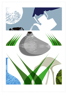
Andy Pavitt, works at the Big Orange studio in London, which has been running for 15 years. He initally came to Stockport to give us a talk about his work. I first came across Pavitt's work a little into my first year on the degree, he has always inspired me with his strict use of shape, even more so, now. Pavitts vector based illustrations, are crisp and clean, flat coloured shapes without so much use of texture. Oppositly different in practice to the work of Tracy Kendall who creates her her intensified wallpapers using blown up photographic imagery. Yet, I it is more the process that ultimately separates the two illustrators.
The Industry - Time
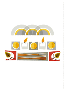
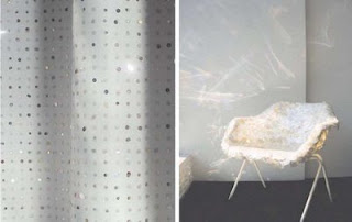
Within the art industry, 'time' is an element that always comes to haunt any designer. The difference is, with these two practitioners, due to the way they work, and who they work for, depends on the timescale they are assigned. Pavitt has been commissioned by a range of newspapers, more specifically, the guardian, (to note but one). Because a newspaper needs new illustrations everyday, that becomes the largest amount of time you will have to complete an illustration, effectively, they have to be simple, original and communicate to their full potential. Kendall has a little more slack when it comes to time. She relies a lot on editorial articles to promote herself, and to some extent is waiting on commissioners coming to her from their discovery of these articles. Her experiment in process and practice lets her work speak out for itself. In contrast to pavitts, I think the scale of Kendalls work, the innovative ‘look’ of it and how it creates a new world, differs from Pavitts editorial pieces. The general scale of one of Kendalls sheets of wallpaper is created to fit a 2.5m tall space. I love the way kendall has designed her wallpapers, in the sense that it is almost interior design due to the space they offer but yet dominate with the large image a strong design concept which interacts with everything else in the room. Like illustration, as a field of design, it can go of on many tangents of graphics and animation. These two designers both know their limitations and stick to what they are good at, but oppositly Kendall's work seems to open more doors with fields of illustration, textile and interior design. You can see this with her creation of furniture elements for example.
The Industry - Time
Within the art industry, 'time' is an element that always comes to haunt any designer. The difference is, with these two practitioners, due to the way they work, and who they work for, depends on the timescale they are assigned. Pavitt has been commissioned by a range of newspapers, more specifically, the guardian, (to note but one). Because a newspaper needs new illustrations everyday, that becomes the largest amount of time you will have to complete an illustration, effectively, they have to be simple, original and communicate to their full potential. Kendall has a little more slack when it comes to time. She relies a lot on editorial articles to promote herself, and to some extent is waiting on commissioners coming to her from their discovery of these articles. Her experiment in process and practice lets her work speak out for itself. In contrast to pavitts, I think the scale of Kendalls work, the innovative ‘look’ of it and how it creates a new world, differs from Pavitts editorial pieces. The general scale of one of Kendalls sheets of wallpaper is created to fit a 2.5m tall space. I love the way kendall has designed her wallpapers, in the sense that it is almost interior design due to the space they offer but yet dominate with the large image a strong design concept which interacts with everything else in the room. Like illustration, as a field of design, it can go of on many tangents of graphics and animation. These two designers both know their limitations and stick to what they are good at, but oppositly Kendall's work seems to open more doors with fields of illustration, textile and interior design. You can see this with her creation of furniture elements for example.
As kendalls wallpaper designs communicate very differently to pavitts editorial work, her designs are better interpreted by aesthetic. The image makes a space pleasing to be in, it captures the viewer, whereas Pavitt’s is heavily relieant on communication. The illustration has to capture the viewer but ultimately lend itself to the text.
The Market
Within the market, the way these practitioners lend themselves to design, is again different. As kendall is more a textile artist, there is not so much a fast or tight time scale for Kendall whereas Pavitt must have had to make often trips to agencys to make contacts and gain commissions. And of course, between the two, the income also differs, kendall told us, a piece of lae she bought from a flee market for maybe £1 has earnt her £50,000- in ration to Pavitt, the cost for a single illustration would be maybe a £100-£200 but he has the cost for his studio rent, yet an advantage of working within this field and having commissions such as Pavitts with newpapers, magazines etc- is the promotion! It's a way to get yourself seen and heard about. Kendall usually promotes herself within exhibitions and as I mentioned relies upon articles which have been wrote about herself and her work. It seems somewhat disheartning for me, knowing that she is doing something she enjoys, creating these wallpapers with objects of her own desire and people approach her when they want the same for themeselves. Pavitt however, is assigned a brief and has to please the client. At the end of the day, it is the client that is commissioning you, you dont have as much freedom as a designer like Kendall. Yet you could typically class her wallpaper designs as illustrations? Why should there be such a big difference in income? Ultimatly the money you earn from an illustration is enough to pay for rent, but you have to have a job on the side. Is this why so many ex-graduating illustrators do not go progress on in the industry?
Because of the areas these two designers separate themselves, interaction of work, differs between the two. Usually because of the scale and context. Yet Kendall doesn't spend months designing, she often designs with the production techniques in mind. Which differs again from Pavitt, as all of his work is computer generated. Kendall has handcrafted her fabricated button chairs and printed her wallpapers.
Working Alone or in a studio?
Kendall works alone, Pavitt works alone, but.. is able to bounce ideas of his colleagues at big orange. The studio itself has a given itself good name within the industry because of the people within it, presently around 8. ultimately if you hand a job in late, the message will get passed on and nobody will want you working for them. Effectively, because of this enviroment, you can learn of other people and be inspired by them. Kendall, uses the market place itself to be inspired where she gathers most of the found imagery she uses within her work. I would say a big plus to the way pavitt promotes himself, is the way he gains his contacts. Cherly Taylor, who is an exgraduate went on an internship to work at big orange for a week or so, after working there, she moved down to london to work full time and is now an established illustrator. Illustrators dont always share contacts but because the market for illustrations is so wide, yet so minimal at present because there are not nearly enough jobs for a graduating illustrators, it is a lot easier to promote yourself and make make contacts. Its easy enough to get out there and get your portfolio seen. The idea of working in a studio, with others, exchanging thoughts on work, intrigues and excites me, it is something I would love to do upon leaving. In comparison to pavitt, kendall prefers to work alone because of the process of her work, the time and space she needs is inevitably enough to get in someone elses way. But, she again, is handcrafting her work and does not have an individual space in a studio to work commitedly on a computer.
Concepts
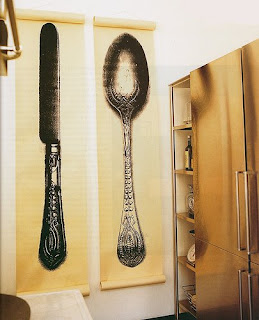
Both practitioners explore their concepts separatly, pavitt will create a range of shapes, layering them on a computer, but also creating a lot of roughs. Roughs are excessively important! As I am learning! For kendall it becomes a case of collection. To find the right spoon, or the right fork but ultimatly the idea is there instantly for her, as she works initially for herself, it is then that people approach her. Conclusively Kendalls commercial work is also her personal work, but then so is any other illustrators, but it differs somewhat.. as an illustrator is pleasing an audience and instinctivly, the client. Yet you have to enjoy illustration to be able to produce it, and especially work you are happy with. Speaking to Pavitt, we talked of how a few members within his studio are constantly creating illustrations, but they differ somewhat from commercial work, ultimatly bring out a new person, this is refreshing. Both of these practitioners have a style which is flowing through their work and is always visible. I have only just found a method of practice, but it seems very laborious, and is a contrast between these two practitiors. A mix of hand crefted elements and computer generated imagery yet, the computer side is somewhat more visible. Like Pavitt, shape offers my work a sense of structure and I am lost within it. I tend to overcomplicate, unlike kendall who uses in her most subjective work either one or two objects. Simplicity and communication I am told is the key to illustration as I have been told.
I chose these two practitioners because of their differences particularly in process which I thought could have a relevant impact upon myself as it is something I love exploring. yet if I have learnt anything from the two, it would consist of a mix of not overcomplicating and keeping things simple, to always be on the lookout for new and exiting ways of creating a design, to keep self promotion at the top of my list and to make sure that I enjoy what I'm doing, not always just trying to please the client.


